Blog/Resources
Top 10 UX Design Websites with Exceptional UX
Nighat Hossain
Nov 8, 2025

Did you know bounce rates jump 32% when page load time increases from one second to three seconds? That single delay costs conversions before users even see your content. Exceptional UX goes beyond speed, though.
It requires instant feedback on clicks, navigation paths under five levels deep, touch targets sized at a minimum of 44×44 pixels, and micro-interactions that confirm actions. You also need accessible color ratios, predictable patterns users recognize instantly, and visual hierarchies that guide eyes to critical information first.
The best websites balance all these elements without making users think twice about where to click next. We've listed 10 websites that execute these principles flawlessly across desktop and mobile.
What is The Role Of UX In Modern Web Design?
UX shapes how users interact with every element on your site, from navigation menus to checkout buttons. It determines whether visitors can find information quickly or leave frustrated. Good UX removes friction by creating intuitive pathways that feel natural to follow. Sites with strong UX convert 400% more visitors because users accomplish goals without confusion.
Beyond conversions, optimized UX cuts bounce rates by 50% through fast load times and clear layouts. Every button placement, color choice, and interaction pattern stems from strategic decisions tested on real users. Companies investing in UX consistently see notable ROI increases because they're eliminating barriers between users and actions.
10 Best UX Website Design Examples with Exceptional UX
We analyzed hundreds of websites to find designs that actually work. These 10 stand out for solving real problems with smart, measurable solutions.
1. Airbnb
Website URL: https://www.airbnb.com/
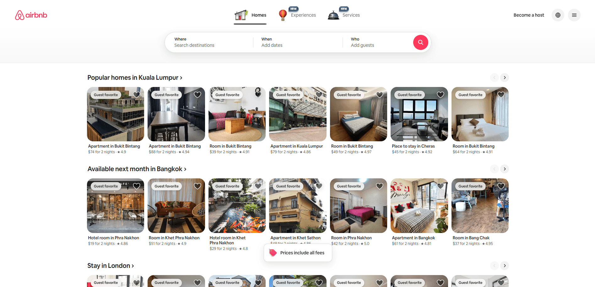
Airbnb builds trust through design that removes booking fear. You see professional photos showing every property angle before committing. These images work alongside guest reviews and star ratings that appear upfront, not buried in tabs.
Host profiles then display verification badges that prove identity instantly. As you search, filters learn your preferences and surface matching listings automatically. The checkout flow follows through with clear payment protection messages that calm anxiety. Throughout this journey, smooth animations make browsing feel like flipping through a travel magazine.
What Makes Their UX Exceptional
Airbnb transforms stranger danger into confident booking through psychological design tactics.
Real Strategy | The UX Impact |
Professional photography service offered free to hosts | Elevates listing quality and increases booking rates |
Map view shows neighborhood context before listing details | Eliminates location uncertainty that blocks decisions |
Personalized homepage adapts based on return visitor status | New users get orientation, returning users get instant search |
Parent-to-child navigation transitions animate between views | Creates spatial understanding of where you are in the flow |
AI-powered photo tours highlight room features automatically | Increases engagement with underused browsing features |
2. Dropbox
Website URL: https://www.dropbox.com/
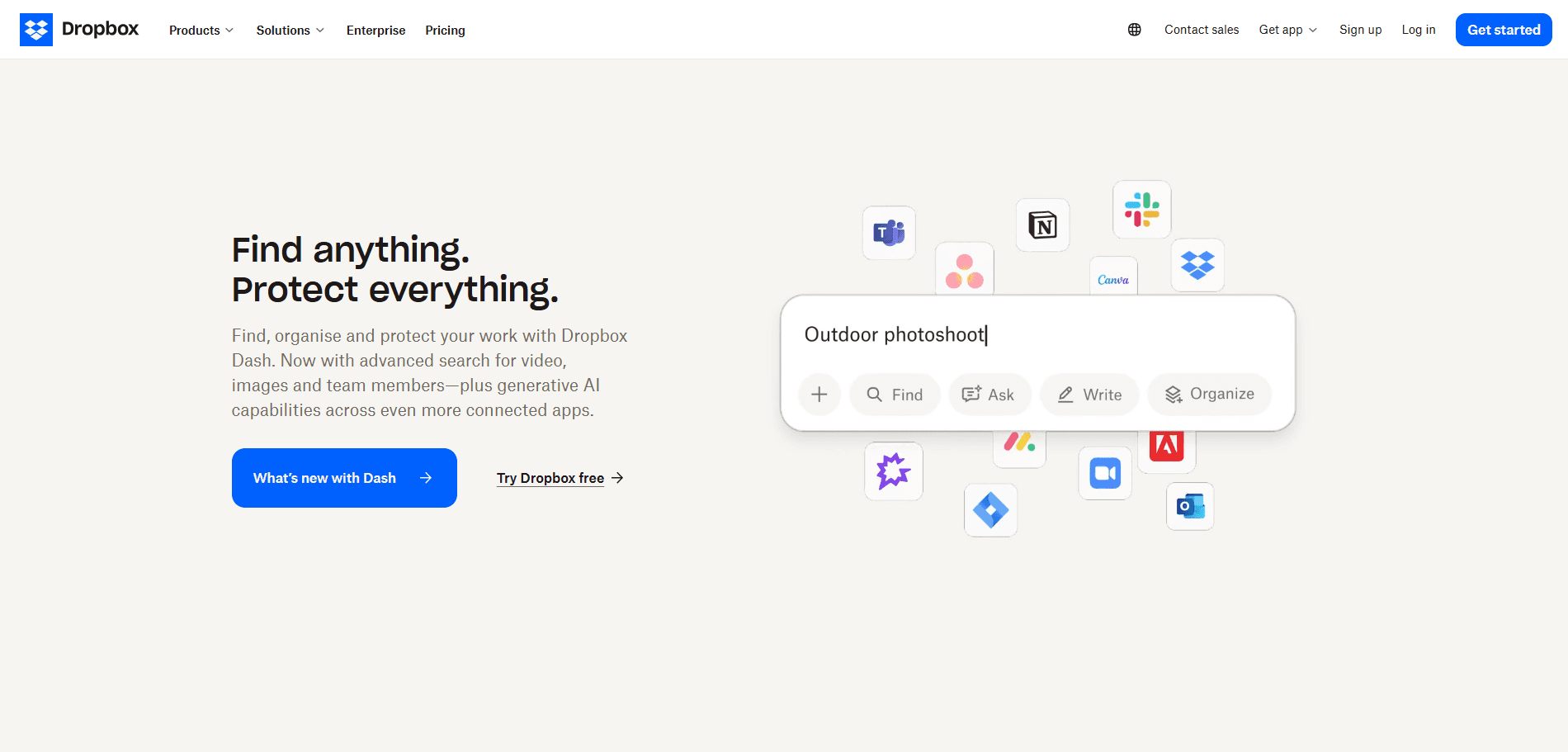
Dropbox eliminates scattered files through intelligent design that speeds up your workflow. You can preview 175+ file types instantly without opening separate apps. Meanwhile, real-time sync keeps your team aligned across all devices.
The platform consolidates storage, sharing, and AI-powered search into one workspace. Beyond that, automatic versioning and encryption protect your work. Their AI assistant Dash learns your patterns and finds files before you ask.
What Makes Their UX Exceptional
Dropbox builds speed into every click through smart design choices you don't notice.
Real Strategy | The UX Impact |
Navigation groups tools by your actual job role | Reduces search effort for role-specific features |
AI summaries show up right on file thumbnails | Cuts time spent opening files for quick checks |
Separate buttons for free trials and enterprise sales | Matches users with appropriate conversion paths |
Live indicators show who's viewing your files | Prevents duplicate efforts across team members |
3. Notion
Website URL: https://www.notion.com/
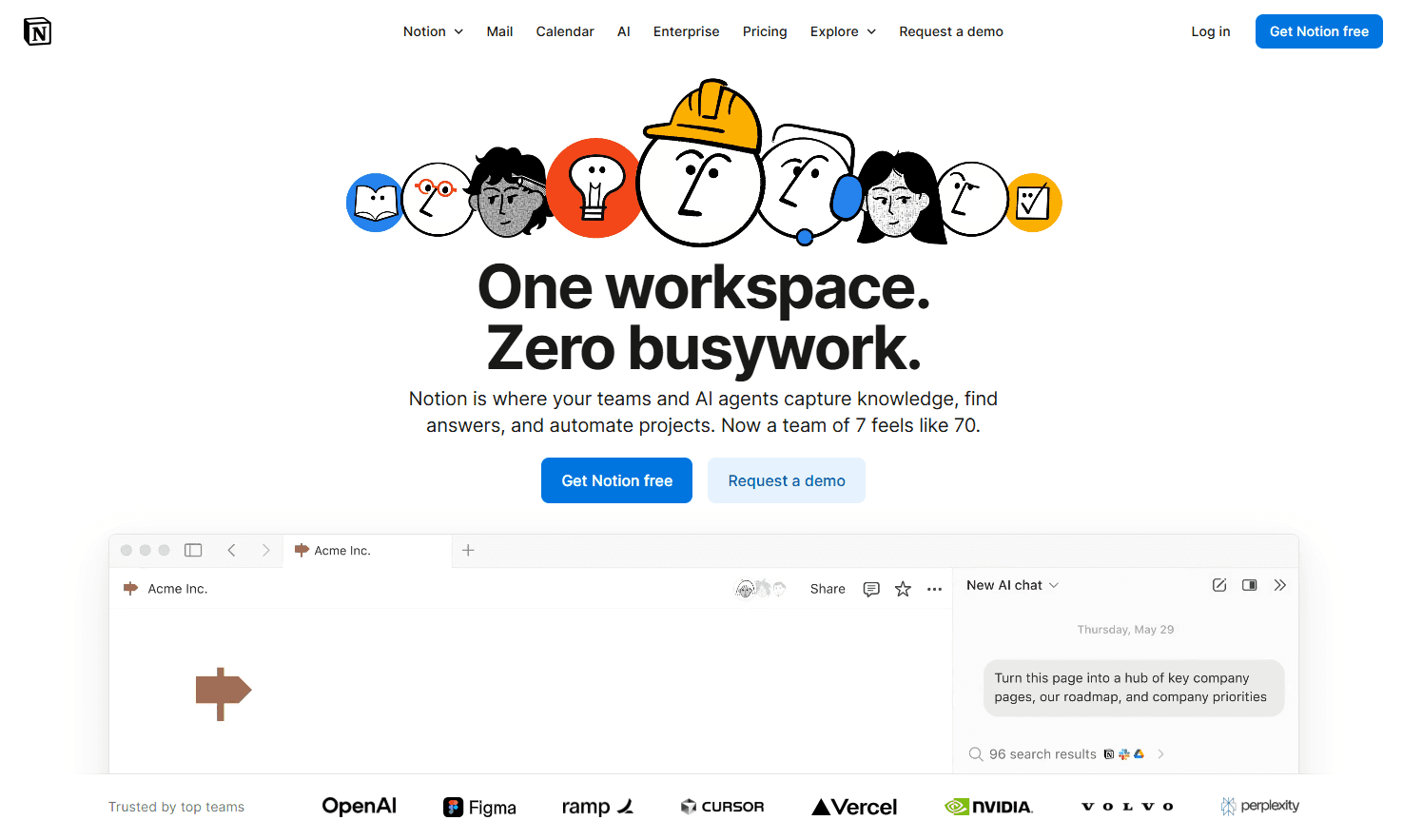
Notion transforms complex workspace management into a fluid experience through block-based architecture. You can drag and drop any content type into nested pages that organize themselves. The interface uses slash commands that let you add databases, calendars, or boards instantly without menus.
Real-time collaboration shows cursor movements and edits as they happen across your team. Templates jump-start projects with pre-built structures you customize immediately. The platform unifies wikis, project boards, and docs into one searchable workspace that cuts tool-switching friction.
What Makes Their UX Exceptional
Notion turns scattered work into structured systems through invisible design intelligence.
Real Strategy | The UX Impact |
A block-based system lets you rearrange anything by dragging | Eliminates rigid templates and page restructuring time |
Live cursor indicators show real-time team activity | Prevents editing conflicts and duplicate work |
Template marketplace pre-loads work structures by role | Cuts setup time from hours to minutes |
Inline databases convert between table/board/calendar views | Matches visualization to your workflow without data migration |
4. Wise
Website URL: https://wise.com/
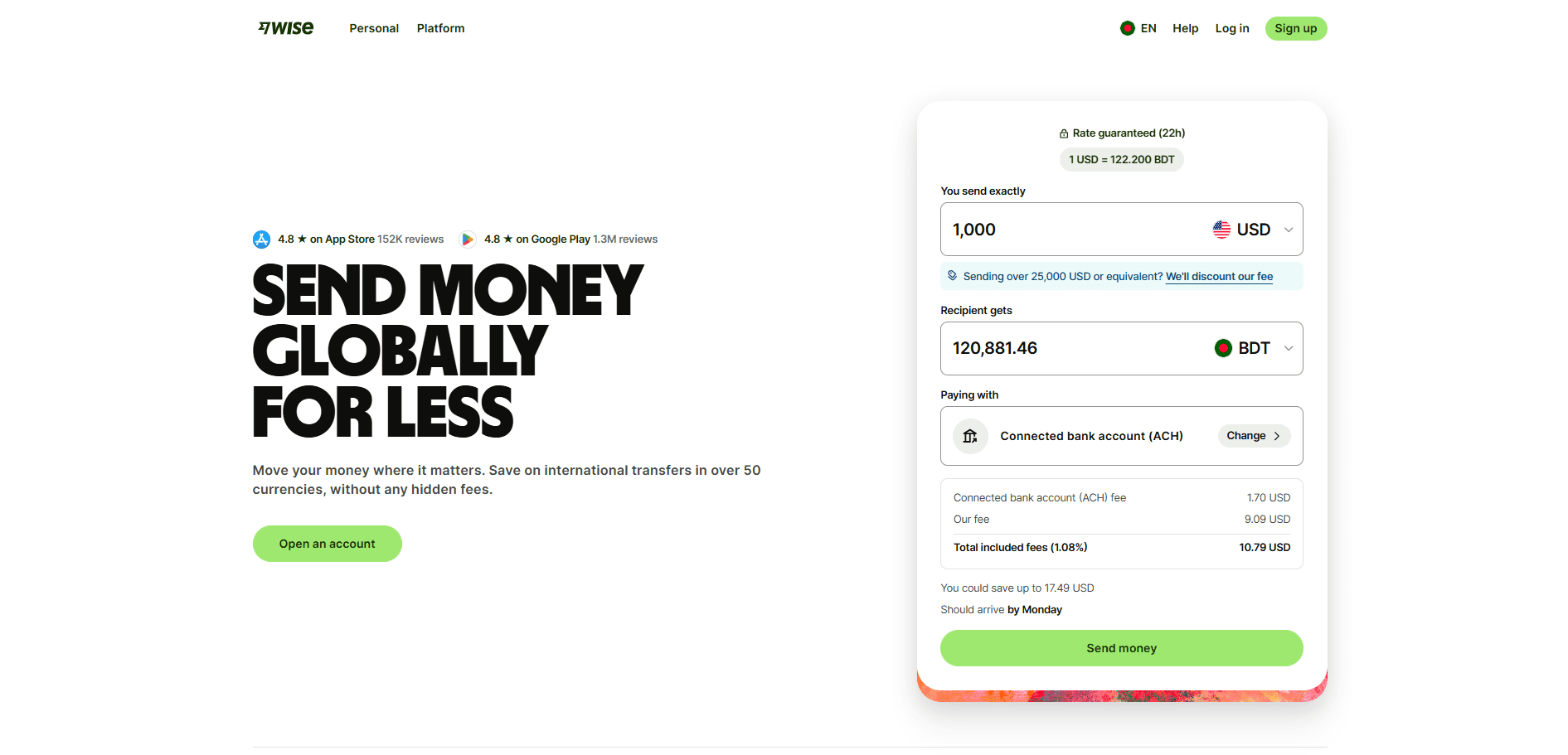
Wise simplifies global money transfers through transparent pricing that exposes hidden bank fees. You compare real exchange rates against competitors before sending. The calculator shows exactly what recipients get in their currency. Progress trackers display where your money is during transfer. Account details for 40+ currencies let you receive payments locally. This price transparency removes fear from international transfers.
What Makes Their UX Exceptional
Wise transforms confusing currency exchange into clear financial decisions.
Real Strategy | The UX Impact |
The side-by-side comparison table shows competitor markups | Reveals true cost differences instantly |
Recipient amount updates live as you type | Removes math from currency calculations |
Transfer speed estimates appear before sending | Sets realistic delivery expectations |
Lock-in feature holds exchange rates for 24 hours | Protects against rate fluctuations |
Multi-currency account dashboard shows all balances | Eliminates switching between currency views |
Fee breakdown separates transfer cost from exchange markup | Makes hidden charges visible |
The progress timeline shows the current transfer status | Reduces "where's my money" anxiety |
5. Dribbble
Website URL: https://dribbble.com/
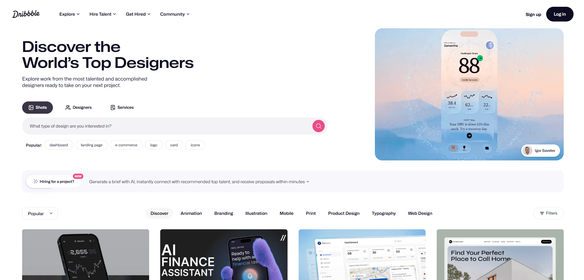
Dribbble serves as the world's leading design showcase platform where 12+ million creatives discover talent and visual inspiration. The platform connects UI/UX designers, illustrators, and brands through a shot-based gallery system. Its visual-first architecture prioritizes instant inspiration discovery over lengthy case studies.
You'll find sophisticated filtering mechanics that narrow 30+ million designs by color, category, timeframe, and tag combinations. The interface balances community engagement features with hiring tools and premium memberships.
What Makes Their UX Exceptional
Smart design choices transform browsing millions of works into effortless discovery:
Real Strategy | The UX Impact |
Infinite scroll loads thumbnails progressively | Users explore more content without pagination breaking their flow |
Layered tag system narrows by category | Reduces 30 million designs to 200 relevant results in two clicks |
Hover reveals GIF previews without clicking | Users assess work quality 60% faster |
Like counts are visible in grid view | Social proof signals quality before opening shots |
Pro badges highlight premium profiles | Hiring managers spot top talent during quick scans |
Sticky filter bar during scroll | Users refine searches without losing their position |
6. Behance
Website URL: https://behance.net
Behance operates as Adobe's creative showcase platform, where 50+ million designers publish full case studies and portfolio projects. The site focuses on complete project narratives. Users upload multi-image sequences showing their entire design process from concept to final delivery. Its integration with Adobe Portfolio creates automatic website generation from published work. You'll find category filtering across 30+ creative fields from UI/UX to fashion photography. The platform combines community features like appreciations and moodboards with professional hiring tools and freelance job postings.
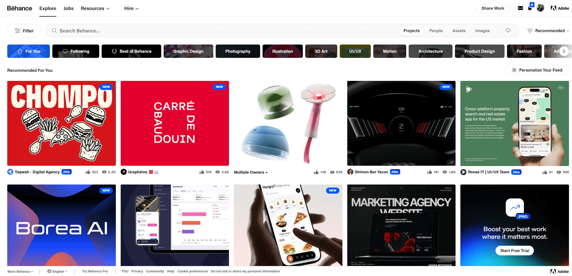
What Makes Their UX Exceptional
Strategic features transform portfolio browsing into deep project exploration:
Real Strategy | Why It Matters |
Projects display 10-20 images in a vertical scroll | Users see research, wireframes, and iterations, not just polished finals |
1400px width applied to every upload | All projects look professional regardless of original file dimensions |
Hover shows likes count and view stats | Reveals which projects attract attention before clicking through |
Moodboard pins save work across portfolios | Builds inspiration collections from 50 creators without bookmarking tabs |
One-click publish from Photoshop and Illustrator | Removes export, resize, and manual upload workflow |
Discipline-specific category filters | UI designers see only UI projects, no unrelated photography work |
Published Behance work generates live portfolio sites | Buildsa custom domain website automatically without extra design effort |
7. Stripe
Website URL: https://stripe.com/
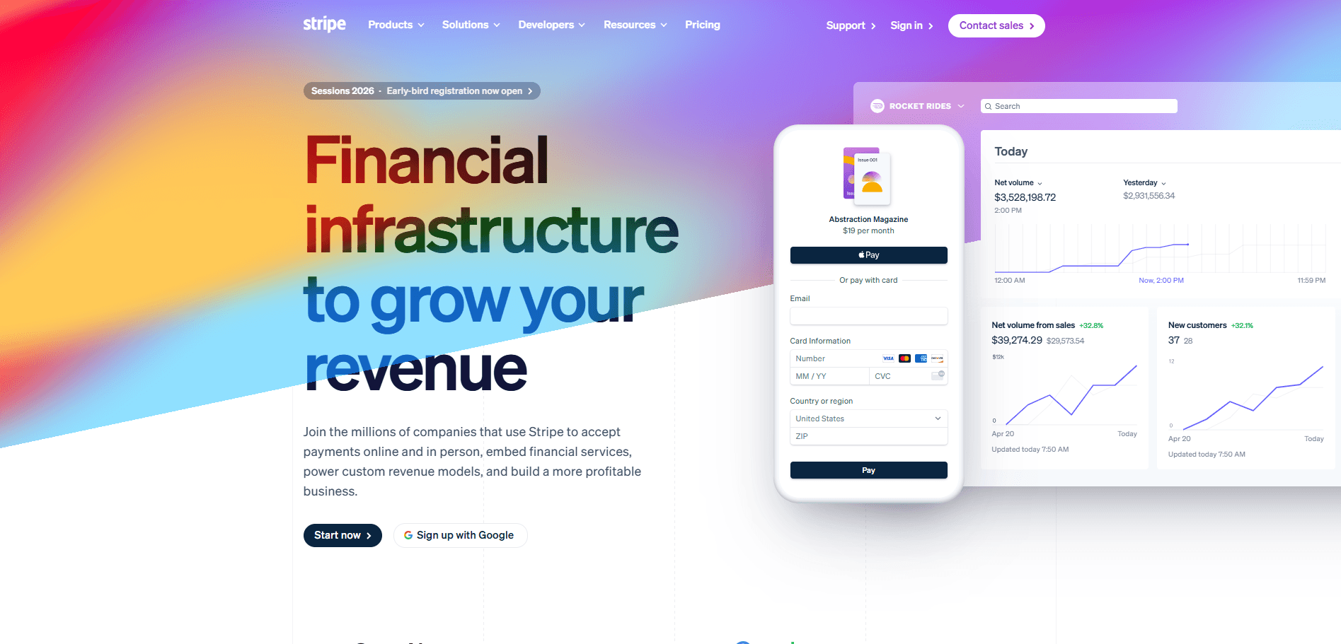
Stripe targets developers through embedded code examples that show exactly how payments work. The interface uses purple gradients and smooth animations that make financial infrastructure feel modern and corporate.
You can see actual API responses and dashboard previews right on the homepage. Interactive pricing calculators let you compare costs instantly without contacting sales. The navigation separates products by clear job functions like payments, billing, and platforms. Product pages skip marketing fluff and jump straight into technical documentation links. This developer-first approach turns complex payment systems into clean, understandable interfaces.
What Makes Their UX Exceptional
Stripe turns technical complexity into developer confidence through strategic interface choices.
Real Strategy | The UX Impact |
Code snippets shown in the hero section | Answers "how hard is integration" instantly |
Products grouped by developer workflow | Cuts time finding the right tool |
API status link in the footer | Removes reliability concerns upfront |
Separate CTAs for startups and enterprises | Matches you with the appropriate onboarding |
Dashboard preview before signup | Eliminates interface uncertainty |
No-code tools alongside developer products | Serves teams without engineering resources |
Live pricing calculator | Removes cost guessing and sales dependency |
8. Mobbin
Website URL: https://mobbin.com/
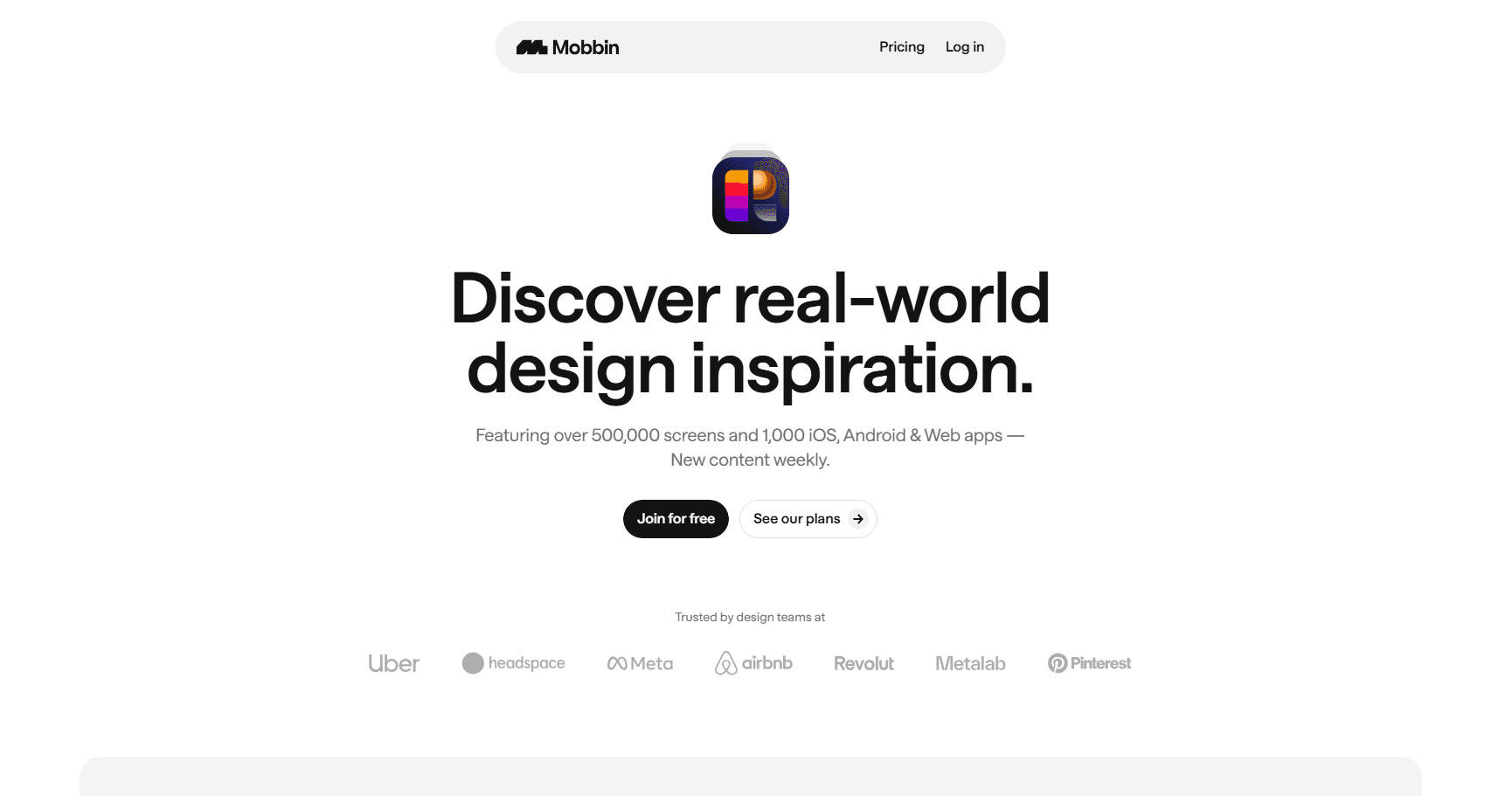
Mobbin organizes 559,600+ mobile screens into searchable categories that match your design problems. You filter by patterns like onboarding, checkout, or navigation instead of scrolling endlessly. The platform shows complete user flows, not just isolated screens.
This reveals how top apps connect multiple steps into smooth journeys. Each example comes from real, successful products already in users' hands. Advanced filters let you narrow by platform, category, and design style instantly. The Figma plugin brings references directly into your workspace.
What Makes Their UX Exceptional
Mobbin cuts research time by organizing inspiration the way designers actually think.
Real Strategy | The UX Impact |
Filters organized by design pattern | Finds solutions without knowing which app has them |
Complete flows are shown step-by-step | Reveals how screens connect in real user journeys |
Weekly updates with new examples | Keeps references current with the latest designs |
Figma plugin for direct imports | Removes tool-switching during active design |
Personal save collections | Builds custom reference libraries across projects |
9. Land-book
Website URL: https://land-book.com/
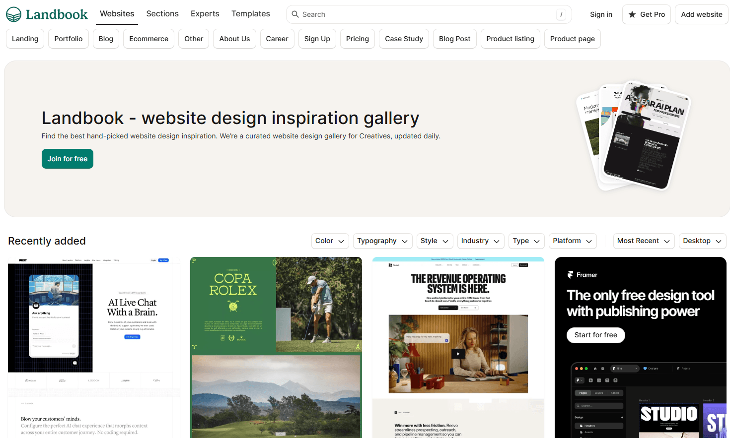
Land-book curates landing page designs from real websites updated daily. You browse through hand-picked examples sorted by industry, style, and design trends. The platform shows full-page screenshots that capture entire landing experiences.
Color filters let you search by specific palettes instantly. Each example links directly to the live site for deeper exploration. The save feature builds your personal inspiration collection across projects. This focused curation beats random Pinterest scrolling.
What Makes Their UX Exceptional
Land-book transforms endless inspiration hunting into targeted design discovery.
Real Strategy | The UX Impact |
Multi-filter dropdowns stack selections | Combines color, typography, and style searches simultaneously |
Page type categories are separated by purpose | Finds pricing pages or blogs without generic browsing |
Large thumbnail grid maximizes visible options | Compares more designs per screen without scrolling |
The platform filter shows device-specific designs | Identifies mobile-first or desktop-only approaches |
Sort by recent versus popular | Balances fresh trends with proven patterns |
10. Habstash
Website URL: https://www.habstash.com/
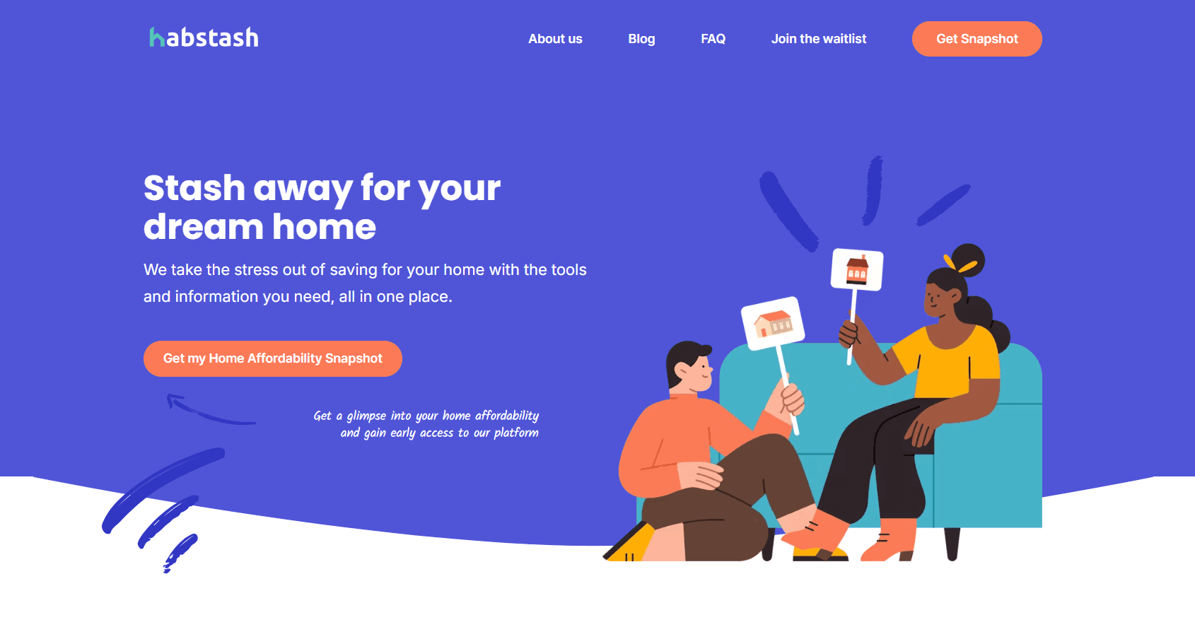
Habstash removes home-buying confusion through instant affordability snapshots. You enter basic financial details and immediately see what homes you can afford in your target area. The interface uses friendly illustrations that make financial planning feel approachable, not intimidating.
Interactive sliders show how weekly savings impact your timeline. The platform breaks down hidden costs like stamp duty and fees upfront. This transparency removes surprise expenses that derail home purchases. Your dashboard updates automatically when market prices shift in your chosen location.
What Makes Their UX Exceptional
Habstash turns overwhelming home-buying calculations into clear, actionable steps.
Real Strategy | The UX Impact |
One-minute snapshot shows affordability first | Validates home-buying feasibility before time investment |
Map integration displays area-specific prices | Connects abstract budgets to real neighborhood options |
Auto-adjusting goals track market changes | Removes manual recalculation when prices fluctuate |
Cost breakdown includes all purchase fees | Eliminates shock from hidden stamp duty charges |
Weekly savings targets feel achievable | Makes large goals digestible through small increments |
Key UX Design Principles All Designers Should Know
Most designers know basic UX theory but miss the psychological principles that actually drive user behavior. These seven laws come from decades of research into how humans make decisions and interact with interfaces.
1. Size and Distance Matter
Make your buttons larger and place them closer to where users actually work. Larger targets placed near task areas cut interaction time dramatically and reduce errors.
2. Limit Choices
Each additional option increases decision time and causes analysis paralysis. Break complex flows into progressive steps instead of showing twelve options at once.
3. Match Expectations
Users expect your site to work like all the other sites they already know. Reinventing standard navigation patterns forces people to relearn basic tasks—most abandon instead.
4. Reduce Cognitive Overload
Users process limited information at once. Group related items logically and reveal details gradually to prevent confusion and improve task clarity.
5. Peaks Define Experience
People judge experiences based on their peak moment and final impression, not the average journey. Optimize your checkout confirmation and error recovery. These emotional peaks define perception.
6. Visual Credibility Drives Trust
Polished visuals signal quality and reliability. Strong aesthetics increase confidence and tolerance for minor friction, especially during first-time interactions.
7. Show Progress Clearly
Users accelerate their efforts as they approach task completion. Show concrete progress indicators like "2 of 3 steps" instead of vague loading states.
The Biggest UI/UX Design Trends to Watch for 2026
Design is shifting from passive interfaces to intelligent systems that adapt, respond, and respect users. Here are the trends shaping 2026:
1. Multimodal and Sentient Interfaces
You will move beyond tapping in 2026. Products will read voice, gesture, images, touch, and even emotional cues. This shift creates interactions that adapt to your state and respond with natural, human-like timing.
2. AI Co-Pilots Powered by On-Device Intelligence
AI will live inside your device chip. You will see instant actions, private data handling, and real-time automation. This trend pushes you to design flows where AI takes initiative without crossing user boundaries.
3. Dynamic Hyper-Personalisation
Personalisation will move from simple recommendations to real-time adaptation. Your interface will change based on location, focus level, intent, or current task. This creates smoother experiences that feel built for that exact moment.
4. Global Compliance-Driven UX
You will design under stronger accessibility, privacy, and AI rules. Navigation, structure, contrast, and labels will reflect global legal standards. This trend pushes teams to think inclusively at the first design step, not the last.
5. Functional Minimalism with Strong Micro-Interactions
Apps will become more powerful, but your screens will look cleaner. You will rely on clear layouts and focused actions. Subtle micro-interactions will guide attention and reduce confusion as features grow.
6. Sustainable UX Becomes a Requirement
Digital carbon output will matter in 2026. You will cut heavy scripts, large images, and energy-intensive patterns. This shift builds lighter products that load faster and reduce environmental strain.
To Conclude
You've seen how speed, accessibility, visual hierarchy, and micro-interactions create seamless experiences that convert visitors into loyal users. Building this level of UX demands specialized expertise, rigorous testing, and a deep understanding of human behavior. Partnering with professionals transforms your vision into measurable results.
Ready to create experiences users remember? Niyot crafts conversion-focused designs backed by 5 years of proven success. Book your free consultation today.
Frequently Asked Questions
Q: How long does it take to see measurable UX improvements after a redesign?
You'll notice immediate changes in bounce rates and time on page within two weeks post-launch. However, reaching statistical significance for conversion optimization requires 4-6 weeks of data collection. Track metrics weekly to identify which improvements deliver the strongest impact.
Q: What's the ROI of investing in professional UX design?
Every dollar invested in UX returns an average of $100 according to industry benchmarks. Better UX reduces customer support costs by 30-50% and increases conversion rates by 200-400%. Companies that prioritize UX see faster user adoption and higher customer lifetime value.
Q: Can I improve UX without completely rebuilding my existing website?
Yes. Strategic improvements to high-traffic pages deliver significant results without full rebuilds. Optimize your homepage, checkout flow, and top landing pages based on heatmap data. Button placement changes, simplified forms, and faster load speeds often produce dramatic improvements within your current framework.
Q: How do you measure UX success beyond just aesthetics?
Track task success rate, time to completion, error frequency, and System Usability Scale scores. Combine quantitative metrics with qualitative data from user interviews and session recordings. The best UX balances multiple metrics. Fast checkout means nothing if confusing error messages cause cart abandonment.