
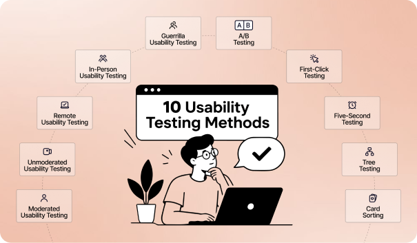
The 10 usability testing methods include moderated, unmoderated, remote, in-person, guerrilla, A/B, first-click, five-second, tree, and card sorting tests for evaluating different UX problems.
Each method answers a different research question. Moderated testing uncovers why users struggle, A/B testing compares design performance, first-click testing examines navigation choices, and tree and card sorting test information architecture. Five-second testing focuses on first impressions and visual hierarchy. Choosing the method based on the research question helps teams collect evidence that leads to clearer design decisions.
Read on to learn when and how to use each method.
What Is Usability Testing?
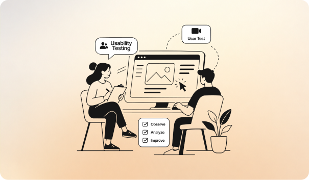
Usability testing is a UX research method where representative participants complete realistic tasks on an interface while a facilitator observes their behavior. This process helps teams identify where users struggle and what needs improvement. The core elements are the facilitator, participant, and task, which work together to create a structured test.
The facilitator gives participants specific tasks and records how they complete them. Depending on the research setup, sessions can be moderated or unmoderated, and conducted remotely or in person.
Researchers focus on observable behavior, such as errors, hesitation, navigation paths, and task completion, rather than opinions alone. Teams can run these tests throughout development, from early concepts and prototypes to the final product.
10 Website Usability Testing Methods Every UX Team Should Know
Moderated Usability Testing
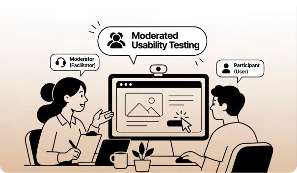
Moderated usability testing is a research method where a trained facilitator guides a participant through live tasks on a product, observing their behavior and asking questions in real time.
The facilitator gives participants realistic tasks on a live product or prototype. They record hesitation, backtracking, mistakes, and other behaviors as they occur.
The facilitator can also use the think-aloud protocol, asking participants to explain what they expect or think as they move through each screen. Sessions can run in a lab or remotely through screen-sharing platforms such as Zoom or Lookback.
Real-time probing is the main advantage of this method. When a participant gets confused, the facilitator can immediately ask why. This can reveal the reasoning behind a problem rather than only showing where the problem occurred.
Key metrics captured during and after a session include:
- Task completion rate — percentage of scenarios completed without assistance
- Time-on-task — time taken to complete a task from start to finish
- Error frequency — number of mistakes or incorrect actions during a task
- System Usability Scale (SUS) — a 10-item questionnaire that produces a 0–100 usability score; 68 is commonly used as the benchmark average
- Single Ease Question (SEQ) — a quick rating of how difficult a participant found a completed task
- Severity rating — an assessment of how seriously a usability problem affects the user experience, often used to prioritize fixes
Jakob Nielsen's research suggests that five participants can uncover a large share of usability problems in a single design round. Teams can then use the findings to identify which issues need attention first.
Unmoderated Usability Testing
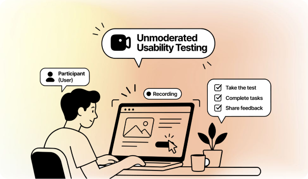
Unmoderated usability testing lets participants complete predefined tasks on their own, without a facilitator present. A testing platform records their screen, actions, and voice.
Platforms such as Maze, Lyssna, and UserTesting deliver the instructions automatically. If a participant gets stuck, nobody steps in to explain the task.
That makes this method useful when you want to see how people use an interface without guidance. It also removes moderator influence, giving participants more freedom to respond naturally.
The biggest advantage is scale. You can send the same test to dozens of participants and collect results within hours.
Key advantages and trade-offs include:
- Cost-effectiveness — requires less researcher time and no lab or session scheduling
- Scalability — many participants can complete the same test at once
- Natural environment — participants use their own device and surroundings
- Reduced bias — no facilitator is present to influence behavior
- No real-time probing — you cannot ask why someone became confused during a task
- Task clarity risk — unclear instructions can affect results because participants cannot ask for clarification
Unmoderated testing is particularly useful for quantitative questions, such as finding out how often users encounter a problem. It provides less insight into why the problem occurs.
This makes task wording critical. If an instruction is unclear, participants may interpret it differently, and there is no facilitator to correct the misunderstanding.
AI-assisted analysis can also speed up the review process. Platforms can transcribe sessions, group similar problems, and identify where participants struggle or abandon a task.
Remote Usability Testing
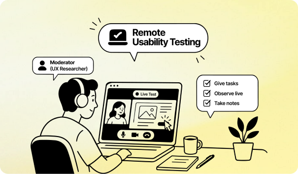
Remote usability testing allows participants to test a product from their own location and device. Researchers can observe sessions live or review recorded sessions later.
Remote testing has two formats:
- Synchronous testing — the researcher and participant join the session at the same time, allowing real-time observation and follow-up questions.
- Asynchronous testing — participants complete tasks independently, while the testing platform records their actions and responses.
Because participants use their usual devices and environments, remote sessions can reveal usability issues that may not appear in a controlled lab. Browser settings, internet conditions, and everyday distractions remain part of the testing context.
Remote testing also expands participant recruitment across locations and time zones. Platforms such as UserTesting and Lyssna can help researchers reach screened participants without requiring in-person sessions.
Important considerations include:
- Session length — moderated sessions commonly run 45–60 minutes, while unmoderated tests are often shorter
- Testing tools — Lookback supports moderated session recording, UserTesting provides participant recruitment, and Maze supports Figma prototype testing
- Common risks — connectivity issues, screen-sharing problems, device limitations, and limited visibility into the participant's surroundings
Before launch, test the study on the target device and confirm recording consent. A short pilot can also identify technical problems before they affect the main study.
AI-assisted tools can transcribe recordings, group recurring usability issues, and flag points where participants struggle. This reduces manual analysis and helps teams review findings faster.
In-Person Usability Testing
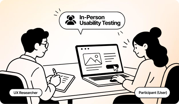
In-person usability testing brings participants and facilitators together in a physical setting, often a usability lab with cameras, microphones, and an observation room.
When you need to see more than clicks and completion times, being in the same room helps. Facial expressions, posture, hesitation, and hand movements can reveal confusion that a screen recording may miss. A facilitator can ask about that reaction immediately.
Real-time probing also helps explain unexpected behavior. If a participant takes an unusual path, the researcher can ask what they expected and what influenced the decision. This gives the team context behind the usability problem.
Specialized eye-tracking equipment can add data on gaze position, fixation duration, and visual scan paths. These measures can show whether users notice important buttons, navigation elements, or warnings. Researchers should still compare this data with task performance and participant feedback.
Key considerations include:
- Behavioral detail — combines task performance with observable user reactions
- Real-time probing — lets researchers investigate problems as they happen
- Specialized testing — useful for hardware, physical interfaces, and controlled prototypes
- Higher cost — labs, equipment, researchers, and participant travel add expense
- Limited reach — location requirements can restrict recruitment
Choose in-person testing when physical behavior or immediate probing can answer questions that remote testing cannot. For larger or geographically dispersed groups, remote usability testing offers easier participant access.
Guerrilla Usability Testing
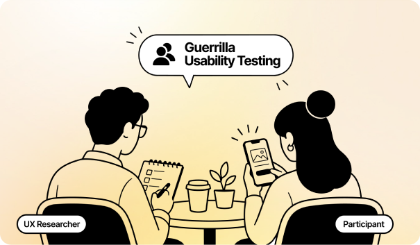
Guerrilla usability testing is a quick, intercept-based method where researchers approach people in places such as cafés, campuses, or public spaces and ask them to test a prototype.
Sessions usually take 5–10 minutes, with participants completing one to three short tasks while thinking aloud. Researchers watch for hesitation, misclicks, and confusing labels without guiding the participant.
Key parameters include:
- Session length — typically 5–10 minutes
- Task load — usually one to three short scenarios
- Sample size — around three to five participants can reveal common early usability problems
- Best stage — early testing of wireframes, navigation, and basic concepts
The main trade-off is participant fit. Because guerrilla testing usually skips detailed screening, the people you approach may not closely match your target users. Public settings can also introduce distractions and recording limitations.
That makes guerrilla testing useful for early validation. Teams can use it to catch obvious problems quickly, then validate important findings through moderated usability testing or unmoderated usability testing with a more relevant sample.
A/B Testing
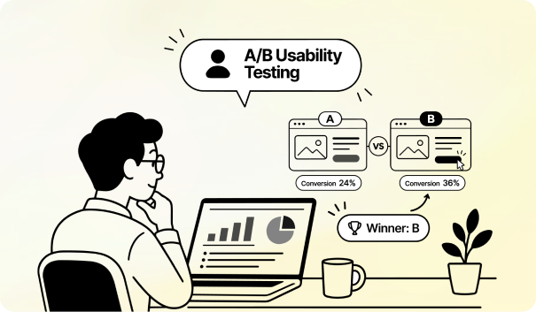
A/B testing compares two versions of a design under controlled conditions. Randomly assigned users see either the control or variant. Teams then compare a primary metric, such as conversion rate, click-through rate, or sign-up completion.
Every test starts with a hypothesis. Teams set the baseline conversion rate, minimum detectable effect (MDE), and statistical power before launch. Checking results repeatedly can increase false-positive risk, so teams should follow a predefined testing plan.
Key parameters
- Significance and power: A common setup uses p < 0.05 and 80% statistical power.
- MDE: Around 5% is a common starting point. High-traffic sites can detect smaller changes.
- Sample size: A 3% baseline conversion rate targeting a 15% relative lift requires roughly 10,000 visitors per variant.
- Duration: Run the test across at least two full business cycles to account for normal traffic variation.
A/B testing tells you which version performs better on the chosen metric. It does not explain why users behave differently. Pair it with moderated usability testing or a think-aloud protocol to identify the underlying usability problem.
First-Click Testing
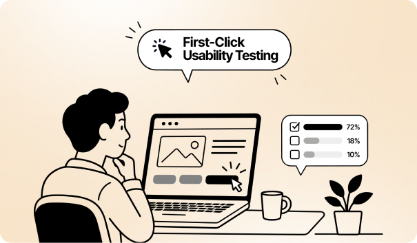
First-click testing records the first action a participant takes after receiving a task. Researchers test a wireframe, prototype, or live page and define the target area in advance. Key outputs include click maps, task success rate, and time to first click.
First-click accuracy matters because the initial choice often shapes the rest of the task. Bob Bailey and Cari Wolfson found that correct first clicks led to 87% task success, compared with 46% after incorrect clicks.
Test the information architecture before the visual interface. Tree testing checks whether users can find items within the category structure. First-click testing then checks whether the visual design makes that structure easy to act on.
How to Read the Click Map
- Clicks cluster on the target: The design clearly directs users toward the intended action.
- Clicks scatter or hit look-alike elements: Visual hierarchy or element recognition may need improvement.
- Clicks land near the target: Labels, positioning, or visual cues may cause uncertainty.
- Time to first click is high: Users may struggle to identify where to start.
Sample size depends on the research goal. 15–30 participants can provide directional insight, while larger samples can support stronger statistical analysis
Five-Second Testing
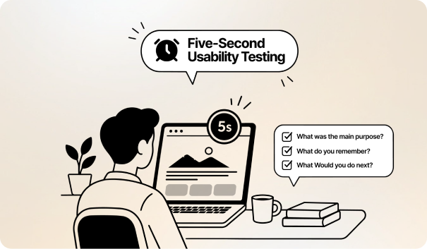
Need to know what users notice before they start scrolling? Five-second testing captures that first impression. Participants view a landing page, mockup, or prototype for five seconds, then answer questions after the screen disappears.
The test can show whether the headline, value proposition, CTA, and brand identity register immediately. Open-ended recall reveals what stands out naturally. Comprehension questions show whether users understand the page’s purpose. Sentiment and brand-attribute questions reveal how the design feels.
Keep the test focused:
- Exposure: Five seconds is standard, but tools such as Lyssna allow longer durations.
- Questions: Ask after exposure to avoid directing attention beforehand.
- Recall: Limit questions so participants do not have to remember excessive detail.
- Best use: Test visual hierarchy, messaging, and first impressions.
Tree Testing
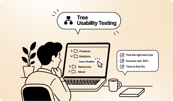
Ever wondered whether users can find an item in your menu without seeing the interface? Tree testing isolates that question. Participants navigate a text-based hierarchy of categories and subcategories to find a specific item.
The method tests information architecture (IA), including category structure and labels. Card sorting helps create that structure, while tree testing validates whether users can find content within it.
For example, ask, “Where would you update your billing address?” Participants might select Account → Billing → Billing Address. The test then shows whether they reached the correct destination and how they got there
Key outcomes include:
- Direct success: Finds the correct destination without backtracking.
- Indirect success: Finds it after retracing the path.
- Direct failure: Chooses the wrong destination without backtracking.
- Indirect failure: Chooses the wrong destination after exploring other branches.
Two metrics make these results useful:
- Success rate: Percentage of participants who reach the correct destination.
- Directness: Percentage who reach it without backtracking.
What counts as a good score? Albert and Tullis rate 61–80% success as good, 80–90% as very good, and above 90% as excellent.
Card Sorting
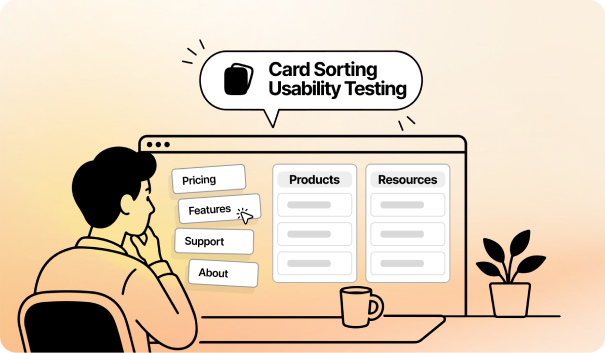
Card sorting is a generative UX research method that reveals how users group and label information. Participants organize cards representing pages, features, or content into categories. The findings inform information architecture (IA), navigation, and menu labels. Tree testing can then validate the resulting structure.
For example, a help center might include cards such as Refunds, Invoices, and Password Reset. Users group related cards and name those groups, revealing how they expect the content to be organized.
Three card-sorting types include:
- Open: Participants create and name their own categories. This reveals their mental models but requires more analysis.
- Closed: Participants sort cards into predefined categories. This tests how well content fits an existing structure.
- Hybrid: Participants use predefined categories but can create additional ones.
Analysis commonly uses a similarity matrix to show how often participants group two cards together. A dendrogram then visualizes patterns in those relationships.
These outputs guide IA decisions, but they should not become the final architecture automatically. Participant selection also matters. If the group does not represent your actual users, the resulting categories and labels may not reflect real expectations.
How to Turn Usability Testing Results Into Better Design Decisions
Group similar observations by task or interface area. Look for repeated patterns across participants. For example, if four of five users miss the same Continue button, that pattern deserves attention.
Step 1: Identify Repeated Usability Problems
Start with affinity mapping to group similar observations by task or interface area. Look for repeated patterns across participants. For example, if four of five users miss the same Continue button, that pattern deserves attention.
Step 2: Separate Major Issues From Minor Friction
Assign a severity rating to each usability problem. Critical issues can block task completion. Serious issues create substantial friction. Minor issues cause smaller problems, such as unclear button labels.
Step 3: Compare User Behavior With Your Assumptions
Compare observed behavior against your original design hypotheses. Use metrics such as task completion rate, time on task, and SUS to identify gaps between expected and actual behavior.
Step 4: Prioritize Issues by Impact
Consider severity, frequency, business impact, and fix effort. An impact-effort matrix can help separate quick improvements from larger design changes.
Step 5: Turn Findings Into Design Changes
Convert each priority finding into a clear problem statement. Connect the observed behavior to its user impact, then specify the design change needed. This gives designers a clear basis for revising wireframes or prototypes.
Step 6: Retest After Making Changes
Retest the revised design to confirm whether the problem improved. The RITE method supports rapid iteration by fixing usability issues as they emerge and testing the changes with additional participants.
Qualitative vs. Quantitative Usability Testing
Qualitative usability testing explains why users struggle, using observations, feedback, and behavior. Quantitative testing measures how often and how much, using metrics such as completion rates, errors, and time on task.
| Factor | Qualitative Usability Testing | Quantitative Usability Testing |
|---|---|---|
| Main question | Why do users struggle? | How often does a problem occur? |
| Data type | Observations, feedback, and user behavior | Numerical metrics and performance data |
| Common methods | Moderated testing, interviews, think-aloud sessions | Unmoderated testing, A/B testing, benchmark testing |
| Typical metrics | Themes, usability issues, user reactions | Task success rate, time on task, error rate, conversion rate |
| Sample size | Smaller groups for deeper insights | Larger samples for measurable patterns |
| Best for | Finding usability problems and understanding their causes | Measuring performance and comparing design changes |
| Research output | Findings that explain user behavior | Data that quantifies user behavior |
| Example | Discovering why users miss a checkout button | Measuring how many users miss the button |
| When to use | Early design exploration or diagnosing usability issues | Validating changes or measuring usability at scale |
| Best approach | Pair with quantitative data when measurement is needed | Pair with qualitative research when the reason behind the numbers matters |
When Should You Conduct Usability Testing?
Conduct usability testing throughout the product lifecycle. Early tests catch usability problems before development, while later tests validate interactions, measure real-world performance, and guide improvements after launch.
During the Research Stage
Test early concepts to understand user expectations, behaviors, and common pain points. Findings can shape user flows and prevent teams from building around incorrect assumptions.
With Wireframes
Test wireframes before visual design and development begin. Users can reveal confusing navigation, missing steps, or unclear content structure when changes remain easy to make.
With Interactive Prototypes
Use interactive prototypes to test realistic task flows before development. Participants can interact with key screens, helping teams identify problems with navigation, interactions, and task completion.
Before Launch
Run usability testing on the near-final product to catch issues that could affect real users. Test critical flows such as sign-up, checkout, search, and account setup.
After Launch
Test the live product to uncover problems that analytics alone cannot explain. User sessions can reveal why people abandon tasks, misunderstand features, or struggle with specific workflows.
During a Major Redesign
Test the existing and redesigned experiences to identify usability improvements and regressions. Testing can show whether changes to information architecture, navigation, or core workflows actually improve the user experience.
Conclusion
Usability testing turns user behavior into evidence. Match each method to its research question. Then act on the findings.
Internal teams often lack researchers, recruitment panels, and testing tools. Niyot's experts fill that gap. For redesigns, we start with a UX audit to pinpoint what breaks. Beyond audits, our services include usability testing, user journey mapping, wireframing, and prototyping. Our team keeps research, UI design, and design systems under one roof. As a result, findings move straight into development-ready designs for SaaS, AI, and MVP products.
Niyot also offers unlimited revisions, so every test round feeds the next iteration. Book a free 30-minute strategy call with Niyot today. Our experts will then map a clear roadmap for your product.
FAQs
How Many Participants Do You Need for a Usability Test?
Five participants per user group usually work well for qualitative usability testing. For quantitative studies, however, you generally need at least 20 participants to identify reliable patterns.
How Much Does Usability Testing Cost?
Usability testing typically costs $1,000–$10,000, depending on the testing method. Participant recruitment, incentives, testing platforms, session requirements, and research teams can also affect the final cost.
How Long Does Usability Testing Take?
Usability testing can take several days to three weeks, depending on the study format. Recruitment, testing sessions, analysis, and multiple testing rounds can all affect the timeline.
What Is the Difference Between Usability Testing and User Acceptance Testing (UAT)?
Usability testing examines how easily users can understand and use a product. UAT, by contrast, checks whether the product meets business requirements before final approval and release.
How Do You Write Good Usability Test Tasks?
Create realistic tasks that reflect actual user goals and situations. Give participants enough context to understand each task, but avoid instructions that reveal how they should complete it.


Jaynal Abedin
Founder & CEOJaynal Abedin
Founder & CEOI'm dedicated to designing products that are simple, intuitive, and built around human needs. My goal is to help startups and brands create experiences users enjoy, trust, and remember for years.