

To hire the right one, start by defining your scope. Then set a realistic budget. From there, vet candidates for genuine mobile-specific experience, since app usability differs sharply from web usability. This structured process is what separates consultants who deliver measurable fixes from those who only hand you vague observations.
Most founders wait until users start uninstalling before they ask what's actually wrong with their app. And here's the hard truth: you can keep guessing at fixes. But without an expert eye, you'll keep missing the real reason people churn.
Those silent drop-offs? They quietly cost you your growth budget. So what's the smart next move?
Hire a UX audit consultant who knows exactly where to look. Someone who can turn findings into action, not just a list of problems.
Confusing? Follow this to hire with confidence and turn expert insight into real conversions.
What Services Are Included In A Typical UX Audit Package?
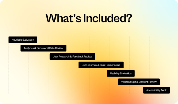
A typical UX audit package covers several areas of the user experience. These include heuristic evaluation, usability testing, analytics review, user research, information architecture, visual and interaction design, accessibility, mobile UX, and conversion analysis.
1. Heuristic Evaluation
UX designers review the product screen by screen against Nielsen's 10 usability heuristics. They examine navigation, consistency, system feedback, error prevention, and user control. Each issue is documented with a screenshot, severity rating, and practical recommendation.
2. Analytics & Behavioral Data Review
The UX team then uses tools such as Google Analytics, Hotjar, or Microsoft Clarity to understand user behavior. They look for funnel drop-offs, rage clicks, repeated actions, and low-engagement pages. These patterns show where users may be experiencing friction.
3. User Research & Feedback Review
User feedback adds context to those behavior patterns. Researchers review interviews, surveys, support tickets, reviews, and customer feedback to identify recurring problems. If more evidence is needed, they may conduct interviews or usability sessions to validate those findings.
5. User Journey & Task Flow Analysis
The review also looks at the complete user journey. UX professionals map important flows such as product discovery, signup, checkout, booking, or account creation. This helps uncover unnecessary steps, dead ends, repeated actions, and friction between different stages.
6. Usability Evaluation
To see how these issues affect actual tasks, UX researchers and designers test important flows from a first-time user's perspective. They identify hesitation, confusion, difficult instructions, and abandonment points while assessing the overall ease of completing each task.
7. Visual Design & Content Review
The visual layer gets the same level of attention. Design reviewers assess typography, spacing, imagery, CTAs, forms, and content hierarchy. They check whether the interface directs attention clearly and flag unclear labels, dense copy, or weak visual hierarchy.
8. Accessibility Audit
Accessibility is reviewed as part of the overall experience. Specialists test keyboard navigation, focus states, color contrast, form labels, text readability, and screen-reader behavior against WCAG guidelines. They also explain how each issue affects users with different accessibility needs.
What is a UX audit?
A UX audit is a systematic review of your digital product that examines how well users can navigate, understand, and complete key actions. It looks at usability, accessibility, functionality, and overall satisfaction to uncover where friction slows your users down.
By studying user behavior, interaction patterns, and feedback, a UX audit highlights what’s working, what isn’t, and why.
The goal is simple: provide clear, data-driven recommendations that help your product perform better and meet user expectations with less effort.
When Should You Conduct a UX Audit?
Did you know users form an opinion about your product in just 50 milliseconds, and 94% of that impression comes from the design?
That’s why timing a UX audit matters so much. Do a UX audit-
- Before redesigning any important page or flow, so improvements come from real user problems, not guesses.
- When your key metrics drop (like conversions, sign-ups, or checkout completion).
- After adding major features or new content to see how they affect the existing experience.
- When customers report confusion, errors, or repeat complaints.
- Before increasing paid traffic to make sure you’re not paying to send users into a broken experience.
- When mobile and desktop behavior don’t match. It often means layout or interaction issues.
- At least once a year to catch slow UX decline caused by updates, code changes, or growth.
- After a brand or messaging update so the product stays clear and consistent.
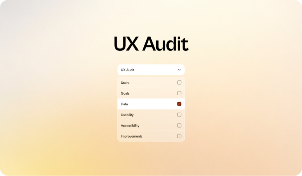
How to Conduct a UX Audit? Step-by-step Guide
Step 1: Understand Your Users First
Before you dive into the interface, take a moment to ground the audit in real user behavior.
Look at your analytics to understand who your core visitors are, skim through recent feedback or complaints to see where frustration builds up, and identify the one or two primary motivations users bring to your key pages.
Step 2: Set Clear Conversion Goals Before Auditing
Every effective UX audit starts with defining exactly what you're trying to improve. Without clear conversion goals, even the best analysis becomes guesswork.
Your goals should break into three layers:
- Primary conversion: How far users scroll on a page. If most users stop halfway, the content may feel too long, irrelevant, or poorly structured.
- Micro-conversions: When users keep jumping back and forth between pages. This usually means they can’t find the information they want or the layout is unclear.
- Behavioral indicators: Moments where users pause for a long time. For example, hovering over a button, stopping before submitting a form, or repeatedly re-reading something. This suggests doubt or confusion.
Here’s how you can do it:
Look at your analytics and identify the top path that leads to the primary action.
Map the 2–4 key behaviors users take before completing it.
Turn each of those into measurable goals for your audit.
Step 3: Explore the Features & Visual Content
Before moving into deeper analysis, let me show something surprising:
Up to 53% of visitors leave a site if loading takes more than 3 seconds. The reason is that slow or poor UX kills engagement.
So, take a quick walkthrough of the interface the way a new user would. The goal is to understand what the design naturally brings forward and what it quietly fades into the background.
Look specifically at:
- Feature visibility: Which actions appear immediately relevant, and which ones are too subtle for users to notice in time?
- Visual hierarchy: Do the headings, images, and CTAs guide attention toward the next logical step, or do they distribute it unevenly?
- Nearby distractions: Any elements sitting close to a key action that may shift attention away from it?
- Supportive visuals: Icons, illustrations, or microcopy that help clarify steps — or add unnecessary complexity.
For example, a large, visually strong hero image can push a primary CTA below the fold, creating the impression that the visual is more important than the action.
This early scan helps you see the interface the way users encounter it through immediate signals, not intended priorities.
Step 4: Collect Quantitative Data
Up to 400% increase in e-commerce conversion rates is possible with strong UX. And for this, you need a reliable UX audit that is anchored in numbers.
Quantitative data shows where users hesitate, drop off, or take longer than expected to move toward a conversion. Reviewing the metrics first gives you an objective baseline before you interpret any visual or behavioral patterns.
Focus on the data that directly reflects user intent:
- Funnel performance: Where users exit the path and how sharply the drop-off shifts between steps.
- Click and scroll patterns: Heatmaps that reveal ignored elements, high-interest areas, or hesitation zones.
- Engagement time: Sections where users spend longer than expected, often signaling confusion rather than interest.
- Interaction frequency: Actions that occur too often (like repeated clicks) or not at all, indicating potential friction.
- Technical performance: Load times, layout shifts, and device-specific issues that can silently reduce conversions.
For example, a page with strong engagement but a low CTA click rate often indicates that users see the content but can’t locate the next step clearly enough. These numbers set the foundation for your audit; they show where the real problems live long before you start diagnosing why they happen.
Step 5: Map the User’s Critical Conversion Paths
After reviewing the data, outline the specific paths users follow when they move toward your main conversion. Focus only on the routes that influence revenue or signal strong intent. This keeps the audit centered on patterns that matter, rather than uncommon user behavior.
Begin by identifying the dominant sequences—the steps that consistently repeat across high-intent sessions. These patterns usually look like a predictable chain:
Entry Point (Landing Page/Home) → Discovery Phase (Service Pages/Portfolio) → Evaluation Stage (Case Studies/Pricing) → Decision Trigger (Contact/Booking) → Conversion Action
As you trace these paths, pay close attention to the moments where users hesitate, change direction, or slow down. These points usually indicate a need for clarity, reassurance, or a stronger cue to continue.
Step 6: Perform a Heuristic Evaluation
A heuristic review gives you a clear picture of how well each screen supports user decisions. Instead of teaching the heuristics, apply them directly to the moments that influence conversions.
Move through the experience the same way users do: quick glance, fast judgment, limited patience. This mindset exposes issues that stay hidden when you already know how the product works.
Focus your assessment on the areas that shape forward momentum:
- Instant understanding: Users should grasp what a screen is asking from them almost immediately. Extra thinking slows progress.
- Reliable interaction patterns: Buttons, links, and feedback should behave the same way across the entire flow. Familiarity builds confidence.
- Friction points: Look for anything that creates uncertainty — unclear labels, vague messages, delayed feedback, or too many choices.
- Cognitive weight (Load): Every decision requires mental effort. Reduce unnecessary choices or competing elements, especially near critical actions.
For example, if a checkout screen presents multiple secondary actions at the same visual level as the main button, users pause to interpret their options — and that pause often leads to drop-off.
Step 7: Audit for Accessibility Factors
Accessibility plays a bigger role in conversions than most teams realize. When key actions or information aren’t accessible to a wide range of users, hesitation increases, errors multiply, and completion rates drop. A quick accessibility pass can reveal issues that silently interrupt the flow for all users.
Focus on the areas that have the strongest impact on completing tasks:
- Action visibility: Primary buttons and links should remain easy to spot in different lighting conditions, contrast levels, and screen sizes. If users struggle to locate an action, the conversion path loses momentum.
- Form clarity: Every field needs a visible label, clear instructions, and immediate error feedback. These simple improvements reduce confusion and help users feel confident as they move forward.
- Navigation support: Ensure users can progress through key steps using keyboard navigation or assistive technologies. Breaks in focus order often reveal underlying friction that affects everyone, especially during checkout or signup flows.
Step 8: Recommend Design & UX Improvements
Once you’ve identified the issues that affect user momentum, turn your findings into a targeted improvement plan. Each suggestion should link back to a friction point you observed — this helps teams act with confidence instead of guessing.
UX Improvements
Enhance the elements that shape users’ understanding and ease of action.
- Simplify or reorder screens where users slow down.
- Strengthen visual hierarchy so primary actions naturally stand out.
- Refine labels, headlines, and supporting text to clarify purpose and reduce hesitation.
CRO Improvements
Address the moments where users question value, risk, or next steps.
- Improve CTA visibility and specificity.
- Add reassurance elements (pricing clarity, return policy, security notes) exactly where data shows hesitation.
- Reduce steps in high-intent flows to maintain momentum.
Technical Suggestions
Correct the performance elements that silently affect user confidence.
- Improve page load times and stabilize layout shifts across devices.
- Ensure forms validate cleanly and provide instant feedback.
- Review how scripts, pop-ups, or third-party tools affect speed and focus.
Step 9: Report your findings and analyze them
A clear audit report turns your observations into decisions. Summarize the issues that have the highest impact on user momentum, connect each one to the evidence you gathered, and outline the improvements that matter most.
Keep your analysis grounded in data. Highlight patterns, explain why specific friction points affect conversions, and show the team where to focus first.
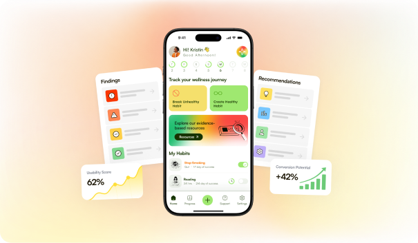
Best Practices for Optimizing the UX Audit Report Impact
A well-structured UX audit report only drives change when it’s communicated effectively.
These best practices help your insights gain clarity, influence decisions, and accelerate improvements.
- Start the report by highlighting the business-impacting wins your recommendations will unlock.
- Sort findings by how directly they affect user momentum and task completion, not by volume.
- Attach screenshots, metrics, heatmaps, or quotes so stakeholders instantly trust the insight.
- Explain issues in terms of lost conversions, higher friction, or wasted acquisition spend.
- Replace vague advice (“improve CTA”) with exact adjustments (“increase CTA contrast and reposition above fold”).
- Explain why a change works — clearer labels reduce hesitation, stronger hierarchy speeds decisions, etc.
- Group recommendations into “Immediate Fixes,” “Next Priorities,” and “Long-Term Enhancements” to reduce overload.
- Flag areas that require engineering, content, or product alignment so teams can plan realistically.
- Use simple annotations, consistent formatting, and one insight per slide/page to improve clarity.
- Combine analytics, recordings, and heuristic insights to reinforce high-impact findings.
- Show which metric each fix should influence — form completion rate, CTA clicks, checkout progression, etc.
- Give teams a simple set of “post-launch checks” to confirm that improvements are working.
- Focus on friction that affects the majority of users or critical paths, not cosmetic fixes.
Top Tools To Use to Conduct a UX Audit
Using the right tools turns your audit from assumptions into evidence. They help you see real user behavior, uncover hidden friction, validate decisions, and back every recommendation with proof. A tool-supported audit is faster, more accurate, and far more convincing to stakeholders.
| Tool | How to Use It in a UX Audit |
|---|---|
| Hotjar | Review heatmaps and recordings to spot hesitation, ignored elements, and scroll behavior across key pages. |
| UserTesting | Watch real users attempt core tasks to uncover confusion, missed cues, and moments where guidance fails. |
| Mouseflow | Analyze session replays and form analytics to diagnose repeated clicks, drop-offs, and hesitation patterns. |
| Crazy Egg | Compare click patterns to see which elements naturally attract attention and which critical actions get overlooked. |
| UserZoom | Run task-based tests and benchmark flows to evaluate how efficiently users move through your conversion paths. |
| Optimal Workshop | Use card sorting or tree testing to validate whether your navigation and structure match user expectations. |

Why Partner With Niyot for Your UX Audit and Redesign?
If you’re relying on internal assumptions or scattered feedback, your product will always miss hidden friction.
Partnering with a professional UI/UX agency like Niyot brings structured analysis, expert judgment, and design execution that turns insights into measurable growth.
With years of experience across SaaS, fintech, eCommerce, and fast-scaling startups, we help brands uncover what users truly struggle with and redesign experiences that convert.
1. Insight-Driven, Not Opinion-Driven
We combine analytics, behavior patterns, and expert evaluation to uncover real friction — not guesswork or aesthetic bias.
2. Conversion-Focused Redesign Expertise
Every UX recommendation is tied to improving clarity, reducing steps, and increasing conversions across your key funnels.
3. Fast, High-Quality Execution
You get rapid turnaround with senior-level design quality, perfect for founders and teams who move fast.
4. Industry-Proven UX Patterns
From fintech trust indicators to SaaS onboarding flows, we apply patterns that already work for your specific audience.
5. Unlimited Revisions Until It’s Right
We iterate with you until the experience feels seamless. No limits and no compromise on quality.
6. Continued Partnership and Post-Launch Support
We provide structured follow-up, performance checks, and ongoing design assistance to ensure your experience continues to evolve and perform.
In Conclusions
A UX audit gives you clarity no guesswork can match. By analyzing user behavior, evaluating key flows, and identifying friction, you gain a clear roadmap for improving conversions and building experiences that users trust. When every insight ties back to business impact, your product moves forward with confidence.
If you’re ready to uncover hidden issues and redesign with precision, partner with Niyot and elevate your user experience.


Jaynal Abedin
Founder & CEOJaynal Abedin
Founder & CEOI'm dedicated to designing products that are simple, intuitive, and built around human needs. My goal is to help startups and brands create experiences users enjoy, trust, and remember for years.